No, leave them as they are. They are wonderful.
|
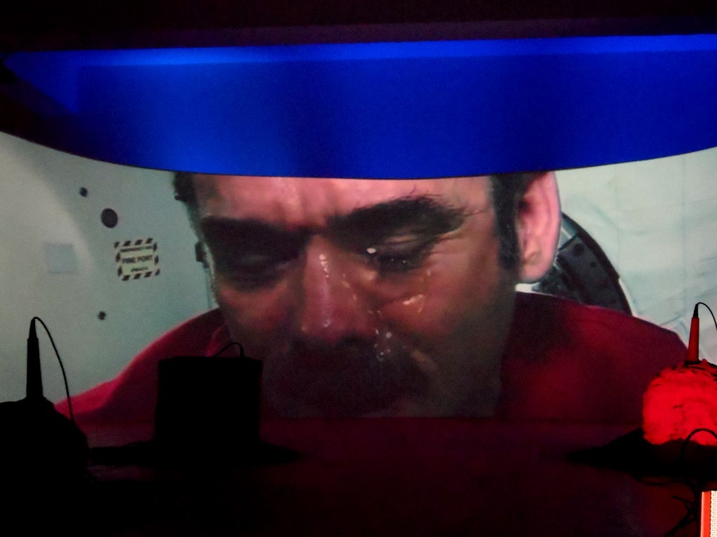
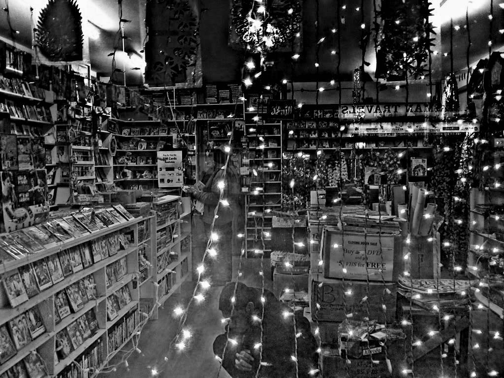
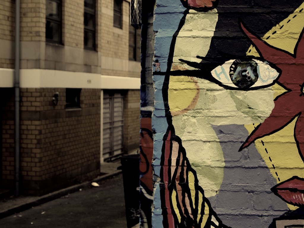
maybe i'm a complete yahoo and this is a more conventional frame but i kinda like it cut this way better-- i like her look more in it.
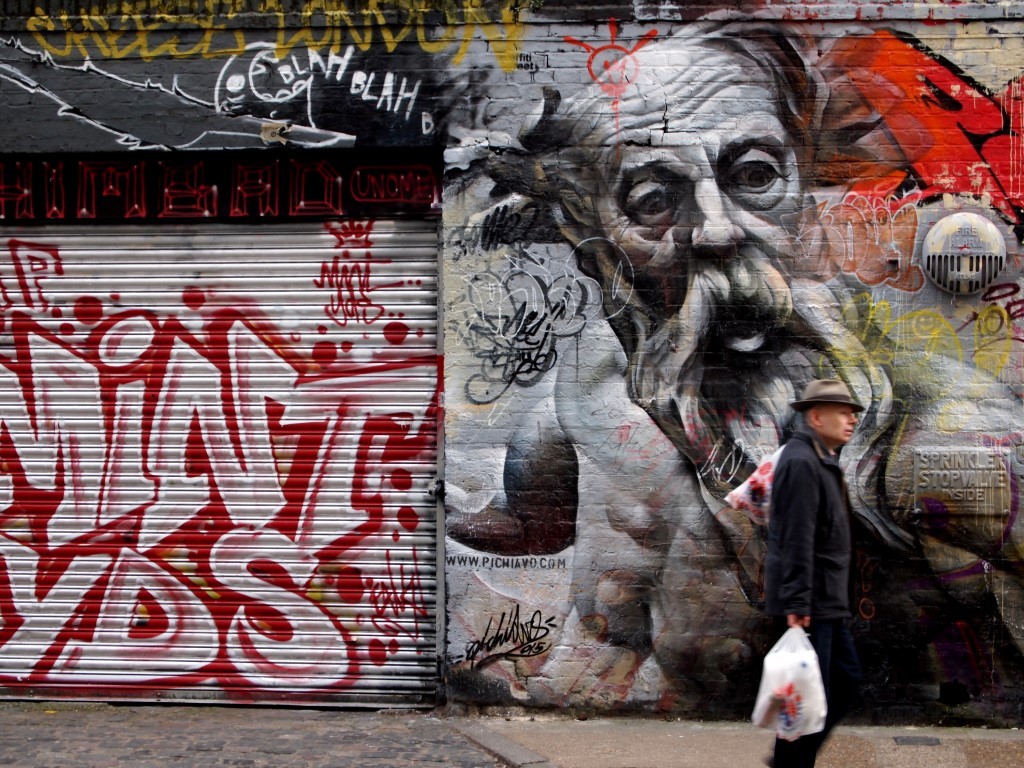
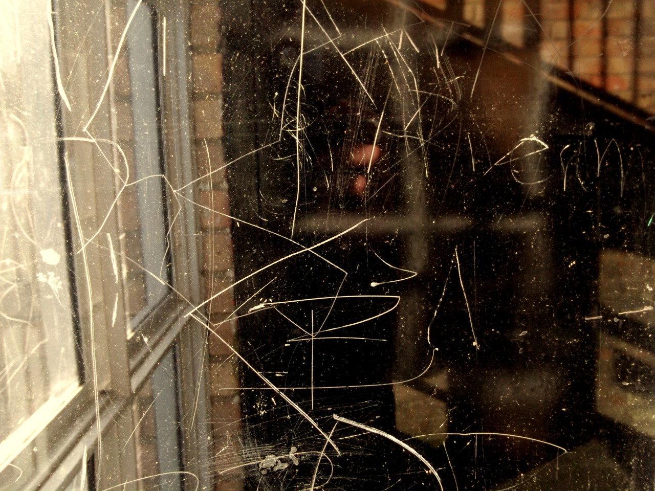
 evidently editing the jpg with a primitive tool (osx preview) has altered the contrast of the original which was so awesome to begin with (this one is greyer) but i thought i'd show what i meant. i think by removing the negative space above her 2 things happened: she looks taller/more powerful, and the triangle of the composition fills the frame more. then again, leonardo gave more head space, but his "lens" is wider, and due to the proportions (more torso, more elbow room) la gioconda's eye line is high on the frame. 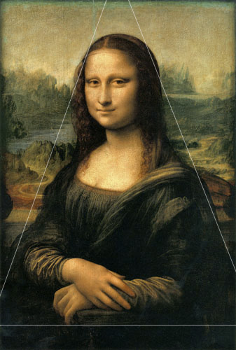 anyway since i don't own antagon's photo nor the right to desecrate it i'll nuke it right after though.  |
Thanks for taking the time to elaborate, !@#$%! To be honest, I wasn't really able to see a difference at first glance but I suppose there is something to it. Props for providing a constructive explanation. I just think I'm not at the top of my game right now, probably have to sort out some personal issues first. I'm contemplating a hiatus.
|
 |
 |
 |
Quote:
Wow! Love that. |
Thanks Demon!
|
 |
 |
   |
   |
   |
   |
    |
   |
    |
    |
  |
   |
  |
|
  |
Quote:
Wow!! Love that. |
|
   |
   |
so happy i reopened this thread.
amazing, beautiful work both of you.. love them. |
wow... some great stuff on this page.
 |
   |
   |
   |
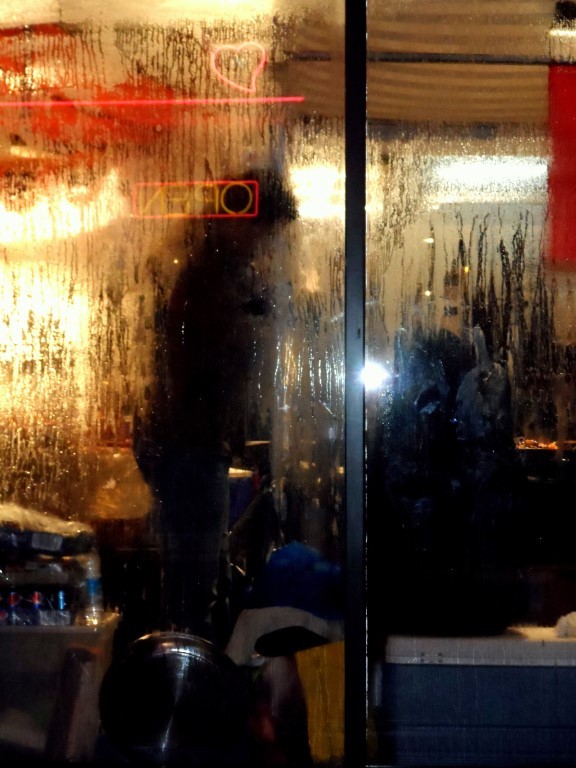
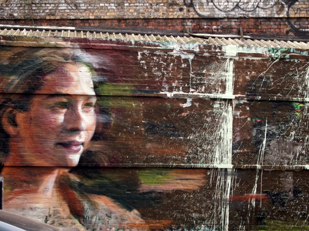
   The last one says "I never wanted you to leave. Sorry". I was out with a good friend of mine when we stumbled across this. She decided to pose like this. |
your work it's very nice Antagon.
|
Thanks, Confusion Is Next. Always loved that song btw.
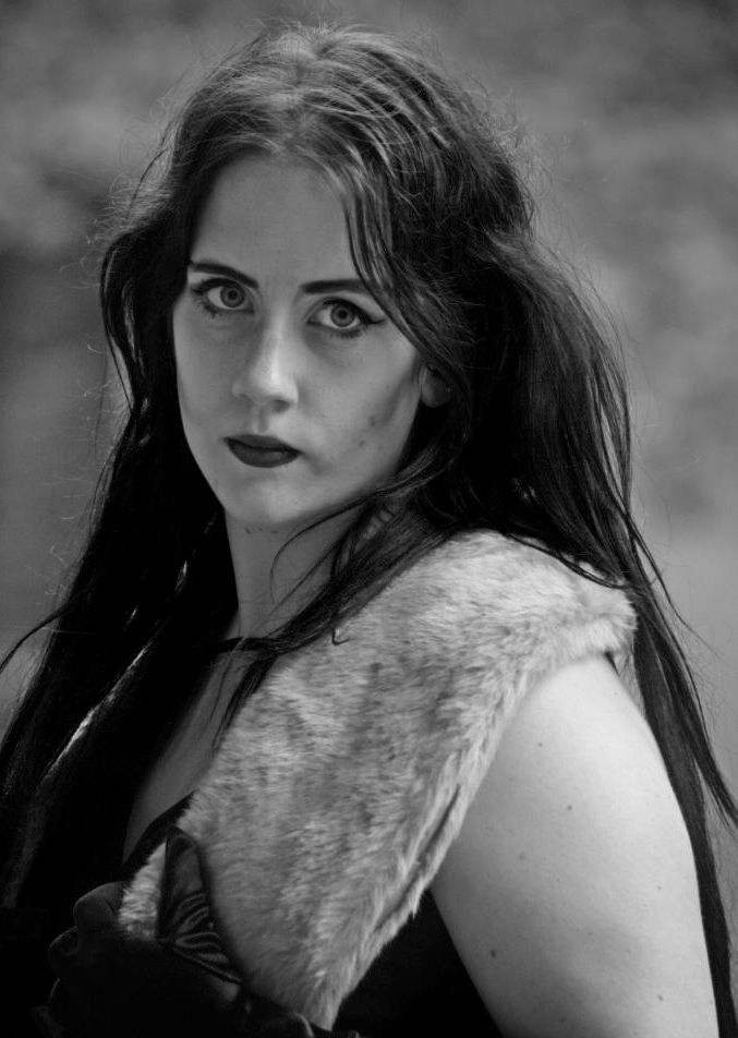
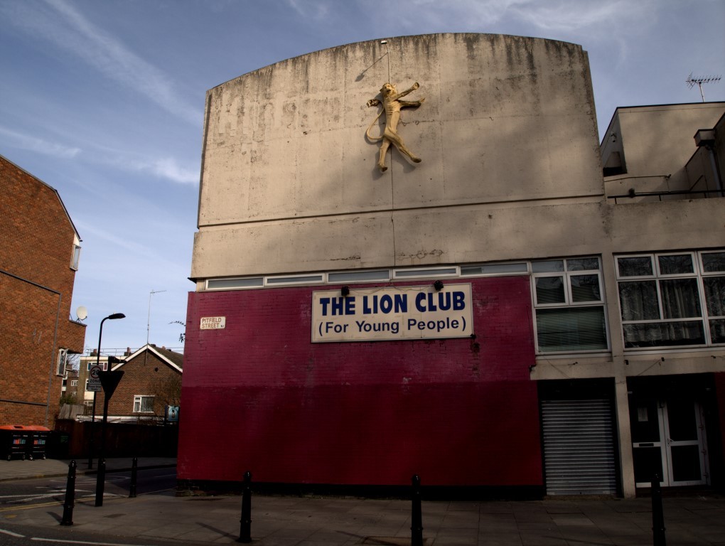
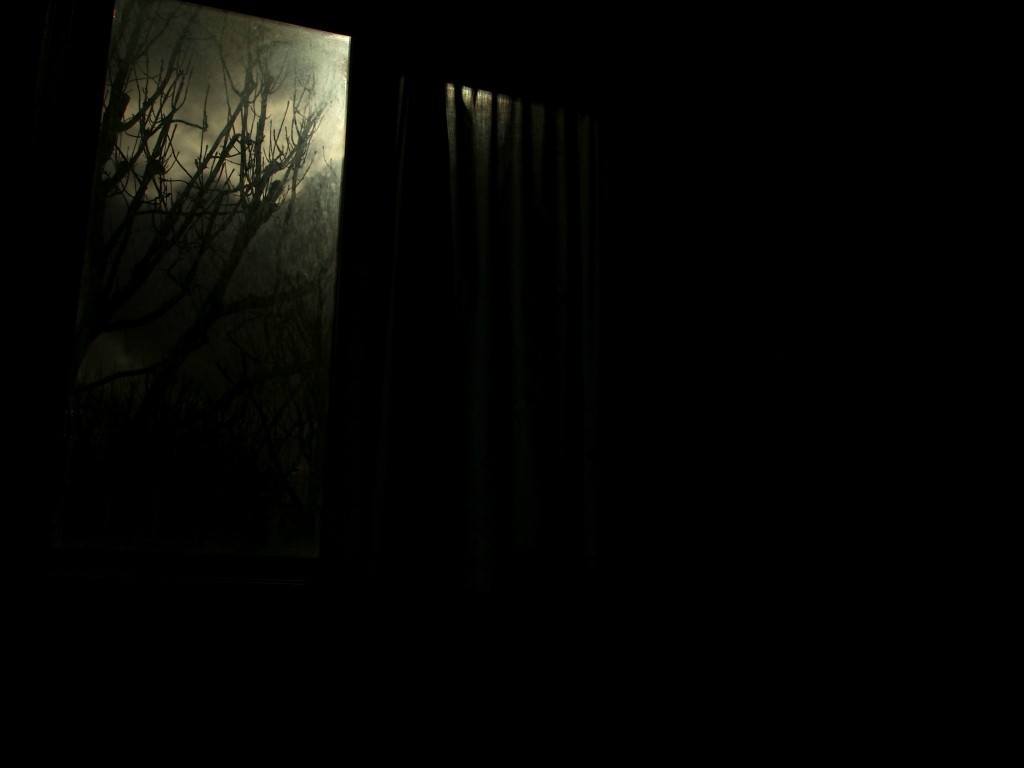
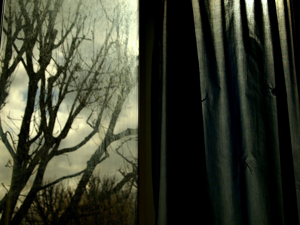
From a current session with an acquaintance of mine. A sort of lightning in a bottle situation, really. We had the most awesome lighting on location.     |
  |
   |
   |
   |
  |
| All times are GMT -5. The time now is 12:11 AM. |
Powered by vBulletin Version 3.5.4
Copyright ©2000 - 2026, Jelsoft Enterprises Ltd.
All content ©2006 Sonic Youth


